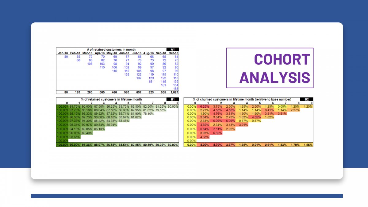

Cohort analysis today is automatically measured using many tools such as Google Analytics or MixPanel, and can also be performed with just a simple excel file. However, not everyone knows how to "read" cohorts and make effective use of this tool. Let's go together ThinkZone Learn how to build and "read" Cohort analysis to draw many useful insights about users' product usage behavior.
* The main content of this article is translated from the above article Christoph Janz's blog, Partner at Point Nine Capital, a VC who has invested in many SaaS companies such as Typeform, Zendesk, FreeAgent,...
HOW TO BUILD AND READ COHORT ANALYSIS?
The idea behind Cohort analysis is that the company wants to find out what proportion of new users in each time period will continue to use the product, for example, out of 100 users in week 1 of October, how many people continue to use the product in week 2, week 3,...
It can be said that Cohort analysis is a table summarizing the Retention rate of user groups in many different time periods, helping us have a clearer view of the product's user retention rate over time, through which we can draw some insights about users and products.
A Cohort Analysis table on Google Analytics looks like this:

Let's learn how to build a Cohort analysis table using Excel. You guys can Download Excel template here (Blue data is input data, other data are calculated from the formula).
Collect data about users/customers
Starting from table A1, the first task is to determine how many users/customers you have each month, and how many of them continue to use the product in the following months. For example: Of the 80 customers in January, 75 continued to use the product in February, 72 in March, etc. We enter similar data with customers in February and the following months.

So it can be seen that the process of building a cohort analysis requires you to be able to clearly separate the customer base that uses your product each month. For example, in the table above, out of 110 customers in April 2013, you need to measure that there are 103 customers using the product in both March and April; 82 customers used in February, March, April; and 70 customers have used the product since January.

With table A2, we simply left-align the data in table A1, to easily compare the number of users remaining after 1 month, 2 months, 3 months,... using the product. The table title also changes from specific months in A1 to “lifetime month”, the number of months in the customer life cycle, in table A2.

Table A3 represents the number of customers leaving the product each month throughout the product life cycle. Data from tables A2 and A3 will be used to calculate ratios in the Cohort analysis table.
Create the Customer Cohort analysis table
Come to table B1, we calculate the percentage of customers of each month who still use the product (retention rate) after 1, 2, 3,... next month.

For example, to calculate the percentage of customers acquired in January who continue to use the product after 3 months (ie April), we take the number of customers from January still using the product in April divided by the number of customers in January, i.e. 70/80 = 87.5%.
How to read table B1
Table B1 is also a Cohort analysis table similar to the example above about Cohort analysis on Google Analytics. When reading this table you will read in several dimensions:
➤ Read horizontally from left to right: The percentage often decreases because customers often leave after a period of using the product. If you see this rate increase in a certain month, it is a sign that customers are returning to use the product after a period of abandonment. This is unusual behavior and it is worth finding out why, because interesting insights often come from such unusual data.
➤ Read vertically from top to bottom: You would expect the percentage to not gradually decrease, because if it is decreasing, it shows that you are not doing a good job retaining customers in recent months.

In contrast to table B1 talking about retention, the table B2 and B3 Look at customer churn rates. The difference between these two tables is that table B2 calculates the churn rate of each row based on the number of customers in a base month (for example, the first row uses the base month of January), while table B3 calculates the churn rate of this month's customers compared to the number of customers in the previous month. (readers check the specific formula in Excel files).
How to read tables B2 and B3
➤ Reading B2 is similar to B1, except that now you're looking at it from the perspective of customer churn.
➤ With B3, you would expect the churn rate to be quite high in the first few months, then decrease and gradually stabilize in the following months, the reason is because customers who are not really the target group of the product will soon stop using, leaving only more "loyal" customers). In the example above, the churn rate in the first 3 months is quite high, then gradually stabilizes at 1.5 - 3%/month.
Create a Revenue Cohort Analysis table
Similar to Customer Retention and Revenue Retention, we also have Customer Cohort Analysis and Revenue Cohort Analysis, in which Revenue Cohort analysis helps you evaluate how much revenue you are keeping throughout the customer lifecycle of using the product.

Figures in the Tables C1, C2, C3 is synthesized similarly to the Tables A1, A2, A3, just replace the number of customers with Monthly Recurring Revenue (MRR).

Table D1 is built and read like table B1, with data taken from table C1. One point to note with Revenue Cohort analysis is that the percentage can be greater than 100%, showing that the company's MRR increased in that month compared to the base month, and this is a good sign that the company is gradually doing better in upselling.

The Tables D2, D3 is also built and read similarly to B2, B3. And also note that a negative MRR churn rate indicates the company's MRR is increasing, just like the analysis above.
Profit forecast
Having MRR, if we add Customer Acquisition Cost (CAC) to the calculation, we can completely predict the company's break-even point. Specific formulas are shown in tables E1 and E2.

Additionally, break-even time can also be calculated using CAC and CLTV (Customer Lifetime Value). ThinkZone will introduce to readers how to calculate CLTV in the next article.
➤ Learn how to calculate CAC through the article: How to calculate Customer Acquisition Cost correctly?
SUMMARY
Above are the accompanying instructions Excel templates Details on how to build and analyze Cohort Analysis. Understanding Cohort Analysis will help companies have a deeper look at customers' product usage behavior, gaining more customer insights.