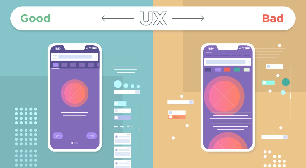

-----
Sign up for ThinkZone's weekly newsletter to not miss the latest blog posts and investment news: https://bit.ly/TZNewsletter_web
-----
WHY SHOULD YOU CARE ABOUT THIS?
“How to design UI/UX so that everyone can quickly get acquainted and know how to use the product after only a short time?”.
We are living in an era filled with interfaces, when each user comes into contact and interacts with dozens, even hundreds of interfaces every day, from websites, apps to advertising screens, ATMs, etc. This process causes the brain to constantly receive information, and analyze how we need to use it with each interface.
Very naturally, complex and difficult-to-use interfaces will tend to be eliminated by the brain. We will prefer to use products that are simple, easy to use, do not take too much time to get used to, and of course we will also prefer those products.
Therefore, designing UI/UX so that everyone can get used to it and know how to use it "after just a moment" is always an important question in the product development process.
This is especially important when the company is in the phase of growing the number of users, because of course a good product that is easy to get used to and easy to use will be easier to get new customers.

Examples of products that anyone can get acquainted with and use "after a moment": The most obvious are products that have hundreds of millions, or even billions of users, because this seems to be a mandatory criterion for a product to reach such a scale:
➤ Slack: The interface is extremely simple, with no distracting or distracting elements, everyone can easily know what they can do, and where to press to perform basic tasks.
➤ Facebook: Similar to Slack, anyone, from young to old, only needs a moment of tinkering to know how to use Facebook's most basic features.
➤ iPhone: Speaking of iPhone, I want to mention the iPhone's boot slider. Greg Christie, the inventor of this slider, gave the iPhone to his 3-year-old daughter to use, and even though she did not understand the words "slide to unlock", she was still able to start the iPhone without instructions.

Photo source: Internet.
HOW TO DESIGN AN INTERFACE THAT EVERYONE KNOWS TO USE “AFTER A SINGLE NOTE”?
Below are four principles for designing such an interface.
1. The design is Clear, Simple, and Unified
➤ Create a clean layout: The layout of the content must have a clear, logical structure, and the type of content must match the purpose of the product.
➤ The elements in the design must be consistent with each other: A design with content and elements (icon, button,...) Unified design helps users easily navigate, understand how to use, and not get confused during use. For example: If the “cloud” icon has been used to represent weather information, do not use it to refer to “cloud computing”; The information field in this form is rounded, so is the case in other forms...
➤ Simplify navigation elements: Show only the main navigation elements, avoid displaying too many unnecessary elements and content on the interface, causing users to become confused and feel confused. Focusing on a few key navigation buttons will help users easily identify their journey to perform a certain task.
➤ Limited to 01 navigation bar: Keep the navigation bar consistent throughout the product, avoid having a different navigation bar for each interface. Mark each page clearly, and add progress bar (progress bar) to represent the customer's journey if they had to go through a multi-step journey.

Image source: UXDesign.cc.
➤ Group of contents: Try to present all information related to the same topic on a single interface so that users can grasp all the information they need, avoiding splitting into multiple pages. Separating information into many pages also makes it difficult for users to remember many different addresses if they want to find a certain information. It also takes time for them to click on many pages over and over again to find all the content they need.
➤ Simplify text fields: Set text content separate from other content. Just one column of text, left alignment, easy-to-read font, and large margins.
➤ Limit using images as background for text.
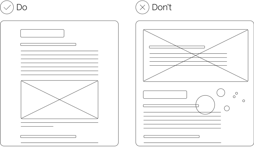
Image source: UXDesign.cc.
➤ Clear Call to action (CTA) button: Buttons, links, or navigational instructions should have clear labels (e.g. “Attach file” instead of just “Click here”). Try not to have too many CTAs, and if there are more than 1 CTA, there should be one main CTA for the entire page, and this CTA needs to stand out from the other CTAs.
➤ Clear content structure, revolving around main content: Avoid having too much text, navigation bars, or CTAs on the same page. Select the main content of that page to highlight and minimize the remaining content.
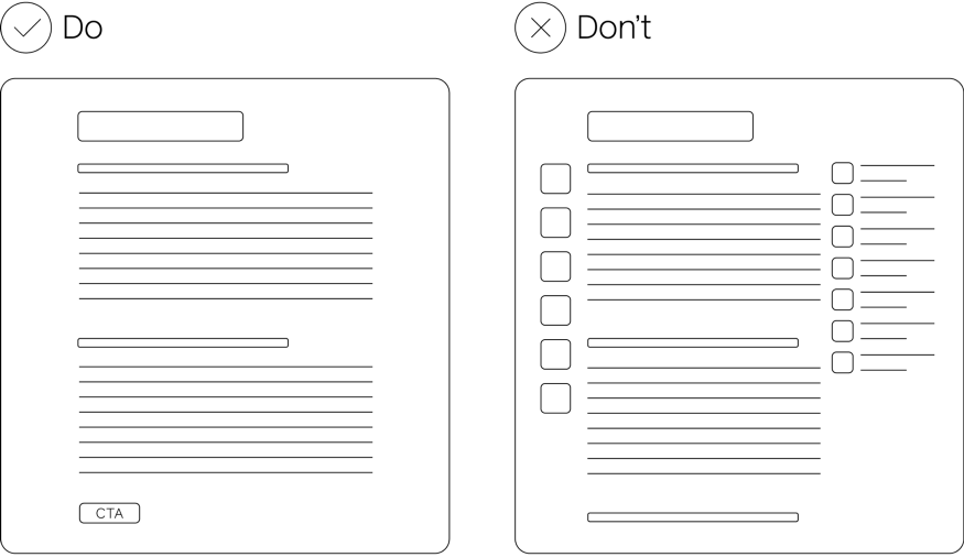
Image source: UXDesign.cc.
A neat, simple layout will minimize the burden on the brain (cognitive load), making it easier for users to use the interface and have a better experience.
2. Avoid any elements that cause ambiguity
Sometimes you will want to use icons instead of text to animate the interface, but the icon itself can have many different meanings, and can be ambiguous to many people. So:
➤ Use short, clear descriptive text with icons and CTA buttons. If adding text makes the interface less neat, you can increase the calculation when hovering over the icon to display a descriptive text label.
➤ Avoid any words/images that may have metaphorical meanings.
Always ask yourself that “Could these buttons/phrases be misleading?”. If so, design it differently.

Image source: UXDesign.cc.
3. Avoid unwanted interactions that disrupt the user journey
Unexpected interactions sometimes reduce the customer experience, and here are some things to keep in mind:
➤ Avoid pop-up content such as advertising banners, videos... if it is not related to the customer's journey. Simply, it's not the content they care about, they have to spend unnecessary time analyzing what the content is, and also waste an additional step of turning off the pop-up. And for those using the product for the first time, this can disrupt their process and create a bad impression. Imagine every time you log into Facebook and you encounter a pop-up advertising banner?
➤ By default, sound is turned off in autoplay videos (videos automatically run) to avoid sudden loud sounds disturbing users.

Image source: UXDesign.cc.
4. Design the most concise and convenient user journey
➤ Review and evaluate all interface pages throughout the entire user journey: The user journey does not end with just one interface, and your job is to ensure all interfaces are simple, easy to use, interconnected, and have a unified flow of content and design. Evaluation must be based on an overview of the entire user journey, not just individual evaluation on 1-2 single interfaces.
➤ The login and registration process is as simple as possible: Every digital journey begins with the registration and login process, and this is often the step where users have to do a lot, from entering information to thinking about passwords. Shorten this process as much as possible by allowing multiple accounts to log in (Facebook, Gmail, Twitter,…) and allows saving login information.

Photo source: Internet.
➤ Make sure users can give feedback if they have difficulty using the product: The feedback button should be designed so that users can easily find it, especially during the product verification stage, in order to promptly grasp customers' errors or difficulty points to improve as soon as possible.
➤ Clearly notify users if they make errors and guide them to fix them: This is also an important note, because the possibility of users making mistakes when first using a product is very high (for example, entering too many phone numbers, missing information, pressing the wrong button, etc.) resulting in functions not running as expected. If there is no notification, there is a high possibility that they will assume that the product is defective. So please clearly report the error and instruct them how to fix it.

Report errors clearly if the user makes a mistake. Photo source: Internet.
SUMMARY
Above are some basic principles to help ensure the product's interface is user-friendly and easy to use. Such a product will significantly reduce the effort users have to spend, thereby giving them a better experience, and this is also a prerequisite for a product to grow strongly in users.
Source: Synthetic.